


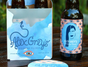
SURREAL BREWING CO.
I am greatly inspired by craft beer labels and packaging.
I created my own fictional brewing company that showcases
my favorite Surreal artists. These designs display my digital
illustrations and handwritten typography.
I am greatly inspired by craft beer labels and packaging.
I created my own fictional brewing company that showcases
my favorite Surreal artists. These designs display my digital
illustrations and handwritten typography.
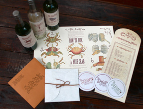
THE SHANTY'S 35th ANNIVERSARY
The Crab Shanty is a family-owned restaurant located in
Ellicott City, Maryland. Within the last two years it has gone
through a major renovation and changed it's name to the
Shanty Grille. For their 35th anniversary, I wanted to create
a throwback theme to the old Crab Shanty, using a vintage
aesthetic, hand-drawn typography and original menu items.
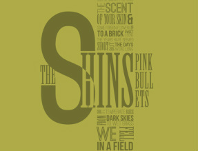
THE SINGER/SONGWRITER PROJECT
This is a series of lyrical posters that would most likely
be displayed in a coffee shop or small music venue. The
posters display a series of type walls, that focus on mixing
various typefaces as well as type structure.
This is a series of lyrical posters that would most likely
be displayed in a coffee shop or small music venue. The
posters display a series of type walls, that focus on mixing
various typefaces as well as type structure.
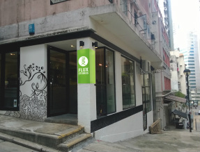
FLUX STUDIOS
Flux Studios is a fictional Graphic Design Studio based
in Sheung Wan, Hong Kong. Our mission as a design
studio is to bring American and Chinese culture together
in our work.
Flux Studios is a fictional Graphic Design Studio based
in Sheung Wan, Hong Kong. Our mission as a design
studio is to bring American and Chinese culture together
in our work.
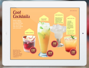
iPAD INTERACTIVE ARTICLE
I created an interactive article, with scrolling text, image
tapping, swiping and fading, through inDesign and the
Adobe Digital Publishing Suite. This article is based on a
printed article in SELF magazine. The goal was to create
new layouts that would work well for an iPad.
I created an interactive article, with scrolling text, image
tapping, swiping and fading, through inDesign and the
Adobe Digital Publishing Suite. This article is based on a
printed article in SELF magazine. The goal was to create
new layouts that would work well for an iPad.
ARTIST BRANDING FOR MYRA HASSARAM
Myra Hassaram is a writer, focusing mainly on autobiographical,
travel, and fictional writing. I created a fictional exhibit to show-
case her work. The poster I designed is a promotional piece for
the exhibit. I also designed a logo for her, which is based on
her signature, and business cards, printed with Akuafoil.
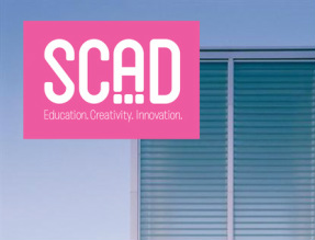
LOGO AND TRADEMARK DESIGN
These are a few logo designs that I have created and their
applications. The SCAD logo is a redesign of the current logo.
The Toronto Olympics logo reflects the city's shield, while
playing off of the Canadian maple leaf and the Olympic flame.
Skidaway Airways is a fictional Savannah Airline. Skidaway
Island is a staple of the Low-country and inspired this logo.
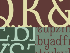
LANISTER: TYPEFACE DESIGN
This is my typeface design. I learned a significant amount
about type structure and form from creating these letters.
I wanted to create a typeface that reflected my design style,
so I chose to create a serif with ornamental qualities.
This is my typeface design. I learned a significant amount
about type structure and form from creating these letters.
I wanted to create a typeface that reflected my design style,
so I chose to create a serif with ornamental qualities.
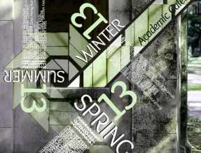
SCAD ACADEMIC POSTERS
These posters use various typography methods to display
the 2013 SCAD Academic Calendar. The first poster makes
use of separation, in which the type and the image are
separate. The other poster directly combines type and image,
where the type is incorporated into the illustration itself.
These posters use various typography methods to display
the 2013 SCAD Academic Calendar. The first poster makes
use of separation, in which the type and the image are
separate. The other poster directly combines type and image,
where the type is incorporated into the illustration itself.
